Note: If some of the controls like progressbar, checkbox and radio buttons are not showing in iOS then add all the files from here to iOS project's Resources folder.
Features
Material UI
Under the XF.Material.Forms.UI namespace, the library offers a number of controls available.
App Bar Customization
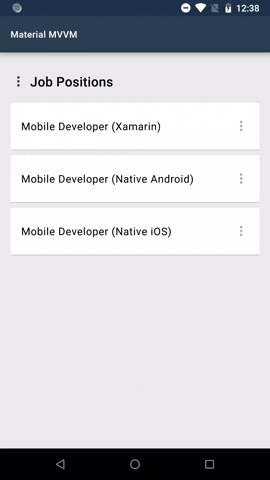
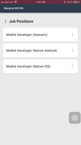
You can customize the appearance of the App Bar by using the MaterialNavigationPage control.
These are attached properties that can be used on pages that are navigated through the MaterialNavigationPage control.
AppBarColor - The color of the app bar.
AppBarTitleTextAlignment - The text alignment of the app bar title. The default value is TextAlignment.Start.
AppBarTitleTextColor - The text color of the app bar title. The default value is Material.Color.OnPrimary.
AppBarTitleFontFamily - The font family of the app bar title. The default value is Material.FontFamily.H6.
AppBarTitleFontSize - The font size of the app bar title. The default value is 24.
AppBarElevation - The size of the shadow below the app bar. The default value is 4.
StatusBarColor - The color of the status bar.
Usage and Behavior
This control uses the new feature of Xamarin 3.3, the TitleView property, to be able to change the appearance of the app bar title.
But when the TitleView property is set on a page, the attached properties will not work.
Cards
Cards contain content and actions about a single subject.
Elevation - The virtual distance along the z-axis. The value determines the importance of the content pesented in this view. The default value is 1.
IsClickable - When set to true, the card displays a ripple-effect when touched.
ClickCommand - The command that will run when this card was touched and the property IsClickable is set to true.
ClickCommandParameter - The parameter to pass in ClickCommand when it is executed.
Event
Clicked - The event that is raised when this card was touched and the property IsClickable is set to true.
Usage
Cards are surfaces that display content and actions on a single topic. They should be easy to scan for relevant and actionable information. Elements, like text and images, should be placed on them in a way that clearly indicates hierarchy.
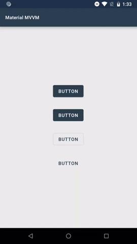
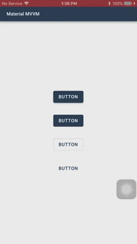
MaterialButton inherits the Button class. MaterialIconButton inherits the ContentView class.
Both of these controls have these common properties:
ButtonType - The type of the button. The default value is Elevated.
Elevated - This button will cast a shadow.
Flat - This button will have no shadow.
Outlined - This button will have no shadow, has a transparent background, and has a border.
Text - This button will only show its label. It will not have a shadow, has a transparent background, and no border. Text buttons has a smaller inner padding as compared to the other button types.
BackgroundColor - The color of the button's background. Outlined and Text button types will always have a transparent background color. Flat and elevated buttons have a default background color based on the value of MaterialColorConfiguration.Secondary.
PressedBackgroundColor - The color of the button's background when it is pressed.
DisabledBackgroundColor - The color of the button's background when it is disabled.
Elevation - The virtual distance along the z-axis.
MaterialButton have these properties:
Image - The icon to be displayed next to the button's label. The color of the icon will be based on the TextColor property value of the button.
AllCaps - Whether the letters in the label of the button should be in upper case or not. By default, this is set to true.
MaterialIconButton has this property:
Image - The image of the button.
TintColor - The tint color of the image.
Usage & Behavior
Buttons communicate actions that users can take. They are typically placed throughout your UI.
Elevated and Flat
These are high-emphasis buttons that are distinguished by their fill color and/or shadow. The actions bound to them are primary to your app.
Outlined
These are medium-emphasis buttons. The actions bound to them are important, but are not the primary action in an app.
Text
These buttons are typically used for less-pronounced actions, which are located in modal dialogs or in cards.
You can set the Elevation property of the button using XAML or C# code. You can also set values when the button is in normal state or pressed state.
Using XAML
<!-- Button with a normal and pressed elevation of `4` -->
<material:MaterialButtonElevation="4"Text="Click" />
<!-- Button with a normal elevation of `4` and pressed elevation of `8` -->
<material:MaterialButtonElevation="4, 8"Text="Click" />
Using C#
// Button with a normal and pressed elevation of `4`varbutton1=newMaterialButton()
{
Elevation=newMaterialElevation(4),
Text="Click"
};
// Button with a normal and pressed elevation of `4` using implicit operatorvarbutton2=newMaterialButton()
{
Elevation=4,
Text="Click"
};
// Button with a normal elevation of `4` and pressed elevation of `8`varbutton3=newMaterialButton()
{
Elevation=newMaterialElevation(4,8),
Text="Click"
};
On press, buttons display touch feedback (ripple effect).
AlwaysShowUnderline - Boolean flag determines whether the underline accent of this text field should always show or not. The default value is false.
BackgroundColor - The background color of the text field. Default hex color value is #DCDCDC.
ErrorColor - The color to indicate an error in the text field. The default value is based on the color value of MaterialColorConfiguration.Error.
ErrorText - The text that will show to indicate an error in this text field. This will replace HelperText when HasError is set to true.
ErrorIcon - The icon that will show to indicate an error in this text field. Will show when HasError is set to true.
FocusCommand - The command that will be executed when this text field receives or loses focus.
HasError - Boolean flag that indicates whether an error has occurred or not in this text field.
HelperText - The text that appears below the text field to indicate additional hints for the text field.
HelperTextColor - The color of the helper text. The default hex color value is #99000000.
HelperTextFontFamily - The font family of the helper text. The ErrorText will use this as its font family.
LeadingIcon - The image icon that will show on the left side of this text field.
LeadingIconTintColor - The color to be used to tint the icon image of this text field. The default hex color value is #99000000.
InputType - The keyboard input type to be used for this text field.
MaxLength - The maximum allowed number of characters in this text field.
Placeholder - The placeholder text of this text field. This property must never be null or empty.
PlaceholderColor - The color of the placeholder text. The default hex color value is #99000000.
ReturnType - The appearance of the return button of the keyboard.
ReturnCommand - The command that will run when the user returns the input.
ReturnCommandParameter - The parameter to be passed in ReturnCommand property when it is executed.
Text - The input text of this text field.
TextChangeCommand - The command that executes when there is a change in this text field's input text.
TextColor - The color of the input text. The default hex color value is #D0000000.
TextFontFamily - The font family of the input text. By default, it uses the MaterialFontConfiguration.Body2 font family.
TintColor - The tint color of the underline accent and the placeholder of this text field when focused. The default color is set to the value of MaterialColorConfiguration.SecondaryColor.
FloatingPlaceholderEnabled - Determines whether the placeholder should float above when the text field is focused.
Choices - When the InputType property is set to MaterialInputType.Choice, provides the list of choices from which the user will select one.
ChoicesBindingName - The name of the property of the items in the Choices property to display.
ChoiceSelectedCommand - The command that will execute when an item is selected using the input type Choice. The parameter that will be passed to this command is the selected item.
HorizontalPadding - The value that determines the left and right padding of the text field.
IsSpellCheckEnabled - Boolean flag determines whether spell checking is enabled in this text field.
IsTextPredictionEnabled - Boolean flag determines whether text prediction is enabled in this field.
TextFontSize - The font size of the text field's input text.
FloatingPlaceholderFontSize - The font size of the text field's floating placeholder.
FloatingPlaceholderColor - The color of the text field's floating placeholder.
IsAutocapitalizationEnabled - Boolean value that determines whether to autocapitalize the input text or not.
IsMaxLengthCounterVisible - Boolean value that determines whether to show the max input length counter on not.
ShouldAnimateUnderline - Boolean value that determines whether to anumate the underline indicator or not.
Events
Focused - Raised when this text field receives focus.
Unfocused - Raised when this text field loses focus.
TextChanged - Raised when the input text of this text field has changed.
ChoiceSelected - The event that will be raised when an item is selected using the input type Choice. Gives the item that was selected.
Completed - The event that will be raised when the user completes the input using the return key.
Usage and Behavior
A text field container, by default, has a fill. You can make the text field's BackgroundColor transparent and AlwaysShowUnderline to true.
The placeholder text should always be visible, because it is used to inform users as to what information is requested for a text field.
Helper text conveys additional guidance about the input field, such as how it will be used. It should only take up a single line, being persistently visible or visible only on focus.
When input text isn�t accepted, an error text can display instructions on how to fix it. Error messages are displayed below the input line, replacing helper text until fixed.
Selection controls allow users to complete tasks that involve making choices such as selecting
options, or switching settings on or off. Selection controls are found on screens that ask
users to make decisions or declare preferences such as settings or dialogs.
Choices - The list of string the user will choose from.
FontFamily - The font family of the text of each radio buttons. The default is the value of MaterialFontConfiguration.Body1.
FontSize - The font size of the text of each radio buttons. The default value is 16.
HorizontalSpacing - The spacing between the radio button and its text.
SelectedColor - The color that will be used to tint this control whe selected. The default is the value of MaterialColorConfiguration.Secondary.
SelectedIndex - The index of the selected choice.
SelectedIndexChanged - Raised when there is a change in the control's selected index.
SelectedIndexChangedCommand - The command that wil run if there is a change in the control's selected index. The parameter is the selected index.
TextColor - The color of the text of each radio button. The default value is #DE000000.
UnselectedColor - The color that will be used to tint this control when unselected. The default value is #84000000.
VerticalSpacing - The spacing between each radio buttons.
Usage and Behavior
Use radio buttons when the user needs to see all available options. The orientation of the radio buttons is limited to vertical position, since
the custom view used to present the radio buttons is a ListView, but the scroll bars will not show since the ListView's height is based on the number
of choices. Each radio button has a fixed height of 48.
Checkboxes
Checkboxes allow the user to select one or more items from a set.
Choices - The list of string the user will choose from.
FontFamily - The font family of the text of each checkboxes. The default is the value of MaterialFontConfiguration.Body1.
FontSize - The font size of the text of each checkboxes. The default value is 16.
HorizontalSpacing - The spacing between the checkbox and its text.
SelectedColor - The color that will be used to tint this control whe selected. The default is the value of MaterialColorConfiguration.Secondary.
SelectedIndices - The indices of the selected choices.
SelectedIndicesChanged - Raised when there is a change in the control's selected inices.
SelectedIndicesChangedCommand - The command that wil run if there is a change in the control's selected indices. The parameter is the list of selected indices.
TextColor - The color of the text of each radio button. The default value is #DE000000.
UnselectedColor - The color that will be used to tint this control when unselected. The default value is #84000000.
VerticalSpacing - The spacing between each checkboxes.
Usage and Behavior
It has the same limitations as MaterialRadioButtonGroup.
Checkboxes can be used to turn an option on or off. If there is only one option, you can use MaterialCheckbox instead.
MaterialCheckbox has the property IsSelected, you can use this to determine whether the option was selected or not.
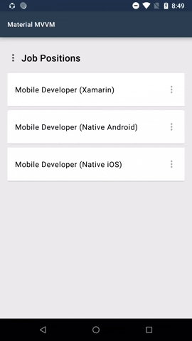
Menus
Menus display a list of choices on temporary surfaces.
MaterialMenuButton inherits the XF.Material.Forms.UI.MaterialIconButton class.
Choices - The list of items from which the user will choose from. You can either assign a collection of string or MaterialMenuItem.
MenuBackgroundColor - The background color of the menu.
MenuCornerRadius - The corner radius of the menu.
Command - The command that will execute when a menu item was selected. The type is Command<MaterialMenuResult>. The result will contain the index of the selected menu and the parameter, if any.
CommandParameter - The parameter to pass in Command property.
MenuTextColor - The text color of the menu items.
MenuTextFontFamily - The text font family of the menu items.
Event
MenuSelected - Raised when a menu item was selected.
Usage and Behavior
Menus are positioned relative to both the element that generates them and the edges of the screen. They can appear in front of, beside, above, or below the element that generates them.
Menus can be dismissed by tapping outside, when an item was selected, or when the back button was pressed in Android.
Be sure to always match the width and height of the child view to the width and height of the menu.
Menu is by default a button. In the menu sample shown above the 3 dots is an added image. This is one of the possibilities how the menu can look like.
Slider
Sliders allow users to make selections from a range of values.

 客服电话
客服电话
 APP下载
APP下载

 官方微信
官方微信


请发表评论