With the Material Components Library:.
Add the dependency to your build.gradle:
dependencies { implementation ‘com.google.android.material:material:1.3.0’ }
In this case you can use a MaterialButton in your layout file:
<com.google.android.material.button.MaterialButton
   ....
   style="@style/Widget.MaterialComponents.Button"
   app:cornerRadius=".."
   app:strokeColor="@color/colorPrimary"/>
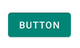
Use app:cornerRadius attribute to change the size of corner radius. This will round off the corners with specified dimensions.
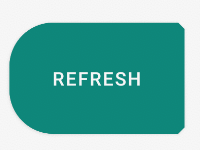
You can also customize the corners using the shapeAppearanceOverlay attribute.
<style name="MyButton" parent="Widget.MaterialComponents.Button.OutlinedButton">
    <item name="shapeAppearanceOverlay">@style/MyShapeAppearance</item>
</style>
<style name="MyShapeAppearance">
    <item name="cornerFamily">rounded</item>
    <item name="cornerFamilyTopRight">cut</item>
    <item name="cornerFamilyBottomRight">cut</item>
    <item name="cornerSizeTopLeft">32dp</item>
    <item name="cornerSizeBottomLeft">32dp</item>
</style>
The official doc is here and all the android specs here.
With Jetpack Compose 1.0.x use the shape parameter:
    Button( onClick = { /* Do something! */ },
            shape = RoundedCornerShape(8.dp)) {
        Text("Button")
    }

    Button(modifier = Modifier.padding(16.dp),
            onClick = { /* Do something! */ },
            shape = RoundedCornerShape(
                50,  // topEndPercent
                0,   // topEndPercent
                0,   // bottomEndPercent
                50.  // bottomStartPercent
            )
    ) {
        Text("Button")
    }

OLD Support Library:
With the new Support Library 28.0.0, the Design Library now contains the Material Button.
You can add this button to our layout file with:
<android.support.design.button.MaterialButton
    android:layout_width="wrap_content"
    android:layout_height="wrap_content"
    android:text="XXXXX"
    android:textSize="18sp"
    android:backgroundTint="@color/colorPrimary"
    app:icon="@drawable/ic_android_white_24dp" />
You can set the corner radius with this attribute:
app:cornerRadius:?Used to define the radius used for the corners of the button

dependencies {
  implementation 'com.android.support:design:28.0.0'
}


