Welcome to OStack Knowledge Sharing Community for programmer and developer-Open, Learning and Share
Welcome To Ask or Share your Answers For Others

Categories

0 votes
558 views
in Technique[技术] by (71.8m points)

xaml - Apple Style Scrollbar WPF

I'm trying to reduce the size of the scrollbar control and make it more "Apple" like since it would fit my interface really well.

What I'm trying to achieve is something that looks like this:

enter image description here

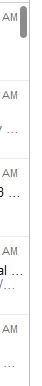
So far all I have is this

        <Style TargetType="{x:Type ScrollBar}">
            <Setter Property="Stylus.IsFlicksEnabled" Value="True" />
            <Setter Property="Background" Value="#8C8C8C" />
            <Setter Property="Width" Value="8"/>
            <Setter Property="MinWidth" Value="8" />
        </Style>

Working XAML

Implementation can be found at Apple Style Scrollbar in WPF

    <!--Scrollbar Thumbs-->
<Style x:Key="ScrollThumbs" TargetType="{x:Type Thumb}">
    <Setter Property="Template">
        <Setter.Value>
            <ControlTemplate TargetType="{x:Type Thumb}">
                <Grid x:Name="Grid">
                    <Rectangle HorizontalAlignment="Stretch" VerticalAlignment="Stretch" Width="Auto" Height="Auto" Fill="Transparent" />
                    <Border x:Name="Rectangle1" CornerRadius="5" HorizontalAlignment="Stretch" VerticalAlignment="Stretch" Width="Auto" Height="Auto"  Background="{TemplateBinding Background}" />
                </Grid>
                <ControlTemplate.Triggers>
                    <Trigger Property="Tag" Value="Horizontal">
                        <Setter TargetName="Rectangle1" Property="Width" Value="Auto" />
                        <Setter TargetName="Rectangle1" Property="Height" Value="7" />
                    </Trigger>
                </ControlTemplate.Triggers>
            </ControlTemplate>
        </Setter.Value>
    </Setter>
</Style>

<!--ScrollBars-->
<Style x:Key="{x:Type ScrollBar}" TargetType="{x:Type ScrollBar}">
    <Setter Property="Stylus.IsFlicksEnabled" Value="false" />
    <Setter Property="Foreground" Value="#8C8C8C" />
    <Setter Property="Background" Value="Transparent" />
    <Setter Property="Width" Value="8" />
    <Setter Property="Template">
        <Setter.Value>
            <ControlTemplate TargetType="{x:Type ScrollBar}">
                <Grid x:Name="GridRoot" Width="8" Background="{TemplateBinding Background}">
                    <Grid.RowDefinitions>
                        <RowDefinition Height="0.00001*" />
                    </Grid.RowDefinitions>

                    <Track x:Name="PART_Track" Grid.Row="0" IsDirectionReversed="true" Focusable="false">
                        <Track.Thumb>
                            <Thumb x:Name="Thumb" Background="{TemplateBinding Foreground}" Style="{DynamicResource ScrollThumbs}" />
                        </Track.Thumb>
                        <Track.IncreaseRepeatButton>
                            <RepeatButton x:Name="PageUp" Command="ScrollBar.PageDownCommand" Opacity="0" Focusable="false" />
                        </Track.IncreaseRepeatButton>
                        <Track.DecreaseRepeatButton>
                            <RepeatButton x:Name="PageDown" Command="ScrollBar.PageUpCommand" Opacity="0" Focusable="false" />
                        </Track.DecreaseRepeatButton>
                    </Track>
                </Grid>

                <ControlTemplate.Triggers>
                    <Trigger SourceName="Thumb" Property="IsMouseOver" Value="true">
                        <Setter Value="{DynamicResource ButtonSelectBrush}" TargetName="Thumb" Property="Background" />
                    </Trigger>
                    <Trigger SourceName="Thumb" Property="IsDragging" Value="true">
                        <Setter Value="{DynamicResource DarkBrush}" TargetName="Thumb" Property="Background" />
                    </Trigger>

                    <Trigger Property="IsEnabled" Value="false">
                        <Setter TargetName="Thumb" Property="Visibility" Value="Collapsed" />
                    </Trigger>
                    <Trigger Property="Orientation" Value="Horizontal">
                        <Setter TargetName="GridRoot" Property="LayoutTransform">
                            <Setter.Value>
                                <RotateTransform Angle="-90" />
                            </Setter.Value>
                        </Setter>
                        <Setter TargetName="PART_Track" Property="LayoutTransform">
                            <Setter.Value>
                                <RotateTransform Angle="-90" />
                            </Setter.Value>
                        </Setter>
                        <Setter Property="Width" Value="Auto" />
                        <Setter Property="Height" Value="8" />
                        <Setter TargetName="Thumb" Property="Tag" Value="Horizontal" />
                        <Setter TargetName="PageDown" Property="Command" Value="ScrollBar.PageLeftCommand" />
                        <Setter TargetName="PageUp" Property="Command" Value="ScrollBar.PageRightCommand" />
                    </Trigger>
                </ControlTemplate.Triggers>
            </ControlTemplate>
        </Setter.Value>
    </Setter>
</Style>
See Question&Answers more detail:os

与恶龙缠斗过久,自身亦成为恶龙;凝视深渊过久,深渊将回以凝视…
Welcome To Ask or Share your Answers For Others

1 Answer

0 votes
by (71.8m points)

It's not very pretty and in all honesty I can't remember where it came from, there is something similar to what you're after in one of my project here, there is probably a lot in the style that's not required or is incorrect but may as well give it a shot.

 <!--Scrollbar Thumbs-->
        <Style x:Key="ScrollThumbs" TargetType="{x:Type Thumb}">
            <Setter Property="Template">
                <Setter.Value>
                    <ControlTemplate TargetType="{x:Type Thumb}">
                        <Grid x:Name="Grid">
                            <Rectangle HorizontalAlignment="Stretch" VerticalAlignment="Stretch" Width="Auto" Height="Auto" Fill="Transparent" />
                            <Border x:Name="Rectangle1" CornerRadius="10" HorizontalAlignment="Stretch" VerticalAlignment="Stretch" Width="Auto" Height="Auto"  Background="{TemplateBinding Background}" />
                        </Grid>
                        <ControlTemplate.Triggers>
                            <Trigger Property="Tag" Value="Horizontal">
                                <Setter TargetName="Rectangle1" Property="Width" Value="Auto" />
                                <Setter TargetName="Rectangle1" Property="Height" Value="7" />
                            </Trigger>
                        </ControlTemplate.Triggers>
                    </ControlTemplate>
                </Setter.Value>
            </Setter>
        </Style>

        <!--ScrollBars-->
        <Style x:Key="{x:Type ScrollBar}" TargetType="{x:Type ScrollBar}">
            <Setter Property="Stylus.IsFlicksEnabled" Value="false" />
            <Setter Property="Foreground" Value="LightGray" />
            <Setter Property="Background" Value="DarkGray" />
            <Setter Property="Width" Value="10" />
            <Setter Property="Template">
                <Setter.Value>
                    <ControlTemplate TargetType="{x:Type ScrollBar}">
                        <Grid x:Name="GridRoot" Width="19" Background="{TemplateBinding Background}">
                            <Grid.RowDefinitions>
                                <RowDefinition Height="0.00001*" />
                            </Grid.RowDefinitions>

                            <Track x:Name="PART_Track" Grid.Row="0" IsDirectionReversed="true" Focusable="false">
                                <Track.Thumb>
                                    <Thumb x:Name="Thumb" Background="{TemplateBinding Foreground}" Style="{DynamicResource ScrollThumbs}" />
                                </Track.Thumb>
                                <Track.IncreaseRepeatButton>
                                    <RepeatButton x:Name="PageUp" Command="ScrollBar.PageDownCommand" Opacity="0" Focusable="false" />
                                </Track.IncreaseRepeatButton>
                                <Track.DecreaseRepeatButton>
                                    <RepeatButton x:Name="PageDown" Command="ScrollBar.PageUpCommand" Opacity="0" Focusable="false" />
                                </Track.DecreaseRepeatButton>
                            </Track>
                        </Grid>

                        <ControlTemplate.Triggers>
                            <Trigger SourceName="Thumb" Property="IsMouseOver" Value="true">
                                <Setter Value="{DynamicResource ButtonSelectBrush}" TargetName="Thumb" Property="Background" />
                            </Trigger>
                            <Trigger SourceName="Thumb" Property="IsDragging" Value="true">
                                <Setter Value="{DynamicResource DarkBrush}" TargetName="Thumb" Property="Background" />
                            </Trigger>

                            <Trigger Property="IsEnabled" Value="false">
                                <Setter TargetName="Thumb" Property="Visibility" Value="Collapsed" />
                            </Trigger>
                            <Trigger Property="Orientation" Value="Horizontal">
                                <Setter TargetName="GridRoot" Property="LayoutTransform">
                                    <Setter.Value>
                                        <RotateTransform Angle="-90" />
                                    </Setter.Value>
                                </Setter>
                                <Setter TargetName="PART_Track" Property="LayoutTransform">
                                    <Setter.Value>
                                        <RotateTransform Angle="-90" />
                                    </Setter.Value>
                                </Setter>
                                <Setter Property="Width" Value="Auto" />
                                <Setter Property="Height" Value="12" />
                                <Setter TargetName="Thumb" Property="Tag" Value="Horizontal" />
                                <Setter TargetName="PageDown" Property="Command" Value="ScrollBar.PageLeftCommand" />
                                <Setter TargetName="PageUp" Property="Command" Value="ScrollBar.PageRightCommand" />
                            </Trigger>
                        </ControlTemplate.Triggers>
                    </ControlTemplate>
                </Setter.Value>
            </Setter>
        </Style>

与恶龙缠斗过久,自身亦成为恶龙;凝视深渊过久,深渊将回以凝视…
Welcome to OStack Knowledge Sharing Community for programmer and developer-Open, Learning and Share
Click Here to Ask a Question

...