
-
 客服电话
客服电话
-
 APP下载
APP下载
迪恩网络APP
随时随地掌握行业动态

-
 官方微信
官方微信
扫描二维码
关注迪恩网络微信公众号
客服电话
APP下载
迪恩网络APP
随时随地掌握行业动态
官方微信
扫描二维码
关注迪恩网络微信公众号
开源软件名称(OpenSource Name):react-dates/react-dates开源软件地址(OpenSource Url):https://github.com/react-dates/react-dates开源编程语言(OpenSource Language):JavaScript 99.9%开源软件介绍(OpenSource Introduction):react-dates
Live PlaygroundFor examples of the datepicker in action, go to react-dates.github.io. OR To run that demo on your own computer:
Getting StartedInstall dependenciesEnsure packages are installed with correct version numbers by running (from your command line): (
export PKG=react-dates;
npm info "$PKG" peerDependencies --json | command sed 's/[\{\},]//g ; s/: /@/g; s/ *//g' | xargs npm install --save "$PKG"
)Which produces and runs a command like: npm install --save react-dates moment@>=#.## react@>=#.## react-dom@>=#.##
Initializeimport 'react-dates/initialize';As of v13.0.0 of Note: This component assumes Include componentimport { DateRangePicker, SingleDatePicker, DayPickerRangeController } from 'react-dates';WebpackUsing Webpack with CSS loader, add the following import to your app: import 'react-dates/lib/css/_datepicker.css';Without Webpack:Create a CSS file with the contents of To see this in action, you can check out https://github.com/majapw/react-dates-demo which adds Overriding Base ClassBy default import React from 'react';
export default React.PureComponent;
export const pureComponentAvailable = true;Overriding stylesRight now, the easiest way to tweak // NOTE: the order of these styles DO matter
// Will edit everything selected including everything between a range of dates
.CalendarDay__selected_span {
background: #82e0aa; //background
color: white; //text
border: 1px solid $light-red; //default styles include a border
}
// Will edit selected date or the endpoints of a range of dates
.CalendarDay__selected {
background: $dark-red;
color: white;
}
// Will edit when hovered over. _span style also has this property
.CalendarDay__selected:hover {
background: orange;
color: white;
}
// Will edit when the second date (end date) in a range of dates
// is not yet selected. Edits the dates between your mouse and said date
.CalendarDay__hovered_span:hover,
.CalendarDay__hovered_span {
background: brown;
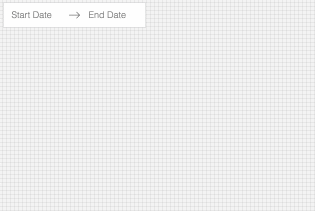
}This would override the background and text colors applied to highlighted calendar days. You can use this method with the default set-up to override any aspect of the calendar to have it better fit to your particular needs. If there are any styles that you need that aren't listed here, you can always check the source css of each element. Make some awesome datepickersWe provide a handful of components for your use. If you supply essential props to each component, you'll get a full featured interactive date picker. With additional optional props, you can customize the look and feel of the inputs, calendar, etc. You can see what each of the props do in the live demo or explore how to properly wrap the pickers in the examples folder. DateRangePickerThe Here is the minimum REQUIRED setup you need to get the <DateRangePicker
startDate={this.state.startDate} // momentPropTypes.momentObj or null,
startDateId="your_unique_start_date_id" // PropTypes.string.isRequired,
endDate={this.state.endDate} // momentPropTypes.momentObj or null,
endDateId="your_unique_end_date_id" // PropTypes.string.isRequired,
onDatesChange={({ startDate, endDate }) => this.setState({ startDate, endDate })} // PropTypes.func.isRequired,
focusedInput={this.state.focusedInput} // PropTypes.oneOf([START_DATE, END_DATE]) or null,
onFocusChange={focusedInput => this.setState({ focusedInput })} // PropTypes.func.isRequired,
/>The following is a list of other OPTIONAL props you may provide to the // input related props
startDatePlaceholderText: PropTypes.string,
endDatePlaceholderText: PropTypes.string,
startDateAriaLabel: PropTypes.string,
endDateAriaLabel: PropTypes.string,
startDateTitleText: PropTypes.string,
endDateTitleText: PropTypes.string,
disabled: PropTypes.oneOfType([PropTypes.bool, PropTypes.oneOf([START_DATE, END_DATE])]),
required: PropTypes.bool,
readOnly: PropTypes.bool,
screenReaderInputMessage: PropTypes.string,
showClearDates: PropTypes.bool,
showDefaultInputIcon: PropTypes.bool,
customInputIcon: PropTypes.node,
customArrowIcon: PropTypes.node,
customCloseIcon: PropTypes.node,
inputIconPosition: PropTypes.oneOf([ICON_BEFORE_POSITION, ICON_AFTER_POSITION]),
noBorder: PropTypes.bool,
block: PropTypes.bool,
small: PropTypes.bool,
regular: PropTypes.bool,
autoComplete: PropTypes.string,
// calendar presentation and interaction related props
renderMonthText: mutuallyExclusiveProps(PropTypes.func, 'renderMonthText', 'renderMonthElement'), // (month) => PropTypes.string,
orientation: PropTypes.oneOf([HORIZONTAL_ORIENTATION, VERTICAL_ORIENTATION]),
anchorDirection: PropTypes.oneOf([ANCHOR_LEFT, ANCHOR_RIGHT]),
openDirection: PropTypes.oneOf([OPEN_DOWN, OPEN_UP]),
horizontalMargin: PropTypes.number,
withPortal: PropTypes.bool,
withFullScreenPortal: PropTypes.bool,
appendToBody: PropTypes.bool,
disableScroll: PropTypes.bool,
daySize: nonNegativeInteger,
isRTL: PropTypes.bool,
initialVisibleMonth: PropTypes.func,
firstDayOfWeek: PropTypes.oneOf([0, 1, 2, 3, 4, 5, 6]),
numberOfMonths: PropTypes.number,
keepOpenOnDateSelect: PropTypes.bool,
reopenPickerOnClearDates: PropTypes.bool,
renderCalendarInfo: PropTypes.func,
renderMonthElement: mutuallyExclusiveProps(PropTypes.func, 'renderMonthText', 'renderMonthElement'), PropTypes.func, // ({ month, onMonthSelect, onYearSelect, isVisible }) => PropTypes.node,
hideKeyboardShortcutsPanel: PropTypes.bool,
verticalSpacing: PropTypes.number,
// navigation related props
navPrev: PropTypes.node,
navNext: PropTypes.node,
onPrevMonthClick: PropTypes.func,
onNextMonthClick: PropTypes.func,
onClose: PropTypes.func,
transitionDuration: nonNegativeInteger, // milliseconds
// day presentation and interaction related props
renderCalendarDay: PropTypes.func,
renderDayContents: PropTypes.func,
minimumNights: PropTypes.number,
minDate: momentPropTypes.momentObj,
maxDate: momentPropTypes.momentObj,
enableOutsideDays: PropTypes.bool,
isDayBlocked: PropTypes.func,
isOutsideRange: PropTypes.func,
isDayHighlighted: PropTypes.func,
// internationalization props
displayFormat: PropTypes.oneOfType([PropTypes.string, PropTypes.func]),
monthFormat: PropTypes.string,
weekDayFormat: PropTypes.string,
phrases: PropTypes.shape(getPhrasePropTypes(DateRangePickerPhrases)),
dayAriaLabelFormat: PropTypes.string,SingleDatePickerThe Here is the minimum REQUIRED setup you need to get the <SingleDatePicker
date={this.state.date} // momentPropTypes.momentObj or null
onDateChange={date => this.setState({ date })} // PropTypes.func.isRequired
focused={this.state.focused} // PropTypes.bool
onFocusChange={({ focused }) => this.setState({ focused })} // PropTypes.func.isRequired
id="your_unique_id" // PropTypes.string.isRequired,
/>The following is a list of other OPTIONAL props you may provide to the // input related props
placeholder: PropTypes.string,
ariaLabel: PropTypes.string,
titleText: PropTypes.string,
disabled: PropTypes.bool,
required: PropTypes.bool,
readOnly: PropTypes.bool,
screenReaderInputMessage: PropTypes.string,
showClearDate: PropTypes.bool,
customCloseIcon: PropTypes.node,
showDefaultInputIcon: PropTypes.bool,
customInputIcon: PropTypes.node,
inputIconPosition: PropTypes.oneOf([ICON_BEFORE_POSITION, ICON_AFTER_POSITION]),
noBorder: PropTypes.bool,
block: PropTypes.bool,
small: PropTypes.bool,
regular: PropTypes.bool,
autoComplete: PropTypes.string,
// calendar presentation and interaction related props
renderMonthText: mutuallyExclusiveProps(PropTypes.func, 'renderMonthText', 'renderMonthElement'), // (month) => PropTypes.string,
orientation: PropTypes.oneOf([HORIZONTAL_ORIENTATION, VERTICAL_ORIENTATION]),
anchorDirection: PropTypes.oneOf([ANCHOR_LEFT, ANCHOR_RIGHT]),
openDirection: PropTypes.oneOf([OPEN_DOWN, OPEN_UP]),
horizontalMargin: PropTypes.number,
withPortal: PropTypes.bool,
withFullScreenPortal: PropTypes.bool,
appendToBody: PropTypes.bool,
disableScroll: PropTypes.bool,
initialVisibleMonth: PropTypes.func,
firstDayOfWeek: PropTypes.oneOf([0, 1, 2, 3, 4, 5, 6]),
numberOfMonths: PropTypes.number,
keepOpenOnDateSelect: PropTypes.bool,
reopenPickerOnClearDate: PropTypes.bool,
renderCalendarInfo: PropTypes.func,
renderMonthElement: mutuallyExclusiveProps(PropTypes.func, 'renderMonthText', 'renderMonthElement'), // ({ month, onMonthSelect, onYearSelect, isVisible }) => PropTypes.node,
hideKeyboardShortcutsPanel: PropTypes.bool,
daySize: nonNegativeInteger,
isRTL: PropTypes.bool,
verticalSpacing: PropTypes.number,
// navigation related props
navPrev: PropTypes.node,
navNext: PropTypes.node,
onPrevMonthClick: PropTypes.func,
onNextMonthClick: PropTypes.func,
onClose: PropTypes.func,
transitionDuration: nonNegativeInteger, // milliseconds
// day presentation and interaction related props
renderCalendarDay: PropTypes.func,
renderDayContents: PropTypes.func,
enableOutsideDays: PropTypes.bool,
isDayBlocked: PropTypes.func,
isOutsideRange: PropTypes.func,
isDayHighlighted: PropTypes.func,
// internationalization props
displayFormat: PropTypes.oneOfType([PropTypes.string, PropTypes.func]),
monthFormat: PropTypes.string,
weekDayFormat: PropTypes.string,
phrases: PropTypes.shape(getPhrasePropTypes(SingleDatePickerPhrases)),
dayAriaLabelFormat: PropTypes.string,DayPickerRangeControllerThe |

2023-10-27
2022-08-15
2022-08-17
2022-09-23
2022-08-13

六六分期app的软件客服如何联系?不知道吗?加qq群【895510560】即可!标题:六六分期
今天小编告诉大家如何处理win10系统火狐flash插件总是崩溃的问题,可能很多用户都不知

今天小编告诉大家如何对win10系统删除桌面回收站图标进行设置,可能很多用户都不知道
今天小编告诉大家如何对win10系统电脑设置节能降温的设置方法,想必大家都遇到过需要
我们在使用xp系统的过程中,经常需要对xp系统无线网络安装向导设置进行设置,可能很多
今天小编告诉大家如何处理win7系统玩cf老是与主机连接不稳定的问题,可能很多用户都不
电脑对日常生活的重要性小编就不多说了,可是一旦碰到win7系统设置cf烟雾头的问题,很
我们在日常使用电脑的时候,有的小伙伴们可能在打开应用的时候会遇见提示应用程序无法
今天小编告诉大家如何对win7系统打开vcf文件进行设置,可能很多用户都不知道怎么对win
今天小编告诉大家如何对win10系统s4开启USB调试模式进行设置,可能很多用户都不知道怎


请发表评论