开源软件名称(OpenSource Name): jtyjty99999/mobileTech开源软件地址(OpenSource Url): https://github.com/jtyjty99999/mobileTech开源编程语言(OpenSource Language): 开源软件介绍(OpenSource Introduction): A useful tools or tips list for mobile web application developing
这个项目收集移动端开发所需要的一些资源与小技巧
可基于下方所列出的统计数据来决定您要兼容的设备及浏览器。
百度移动统计
友盟指数
CNZZ 桌面及移动端浏览器统计
全球移动端浏览器统计
HTML5 与 CSS3 技术应用评估
各种奇妙的hack
几乎所有设备的屏幕尺寸与像素密度表
移动设备参数表
ios端移动设备参数速查
浏览器兼容表
移动设备查询器
移动设备适配库
移动设备适配库2
viewport与设备尺寸在线检测器
html5 移动端兼容性速查
在线转换字体
css3 选择器测试
测试浏览器对 ECMAScript6 的支持度
兼容性速查表
浏览器的一些独特参数
各种各样的媒体查询收集
css3 动画在线制作器
css3 渐变在线制作器
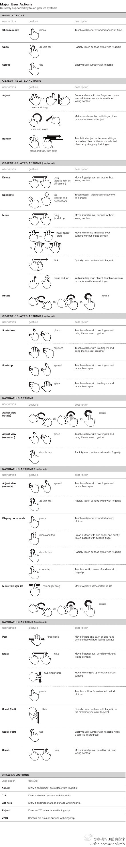
移动端手势表
webkit独有的样式分析
HTML5 Cross Browser Polyfills
HTML5 POLYFILLS
iPhone 6 屏幕揭秘
Firefox 浏览器内置了 自定义设计视图 的功能,可以通过 Firefox->Web 开发者->自定义设计视图(或者摁下 Shift + Ctrl + m )。相比网络工具,运行更加流畅,无需联网。
判断 iPad 和 iPhone 的版本和状态的 CSS 媒体查询代码
Viewport Resizer
http://beta.screenqueri.es/
http://responsivepx.com
http://www.responsinator.com/
http://resizemybrowser.com/
https://quirktools.com/screenfly/
媒体查询常用样式表:
<link rel="stylesheet" media="all and (orientation:portrait)" href="portrait.css">    // 竖放加载
<link rel="stylesheet" media="all and (orientation:landscape)"href="landscape.css">   // 横放加载

//竖屏时使用的样式
<style media="all and (orientation:portrait)" type="text/css">
	#landscape { display: none; }
</style>

//横屏时使用的样式
<style media="all and (orientation:landscape)" type="text/css">
	#portrait { display: none; }
</style>
It’s not a web app. It’s an app you install from the web.
当前 WEB APP 开发的最佳实践
如何自适应网页屏幕
以及配套的解决方案
手Q开发过程中经验沉淀
webview性能优化
移动Web单页应用开发实践——页面结构化
移动Web产品前端开发口诀——“快”
移动Web开发,4行代码检测浏览器是否支持position:fixed
使用border-image实现类似iOS7的1px底边
移动端web页面使用position:fixed问题总结
移动Web开发实践——解决position:fixed自适应BUG
移动手机浏览器m3u8格式视频流播放支持程度测试
指尖下的js ——多触式web前端开发之一:对于Touch的处理
指尖下的js ——多触式web前端开发之二:处理简单手势
指尖下的js —— 多触式web前端开发之三:处理复杂手势
meta标签大全 http://segmentfault.com/blog/ciaocc/1190000002407912
meta标签,这些meta标签在开发webapp时起到非常重要的作用
<meta content="width=device-width; initial-scale=1.0; maximum-scale=1.0; user-scalable=0" name="viewport" />
<meta content="yes" name="apple-mobile-web-app-capable" />
<meta content="black" name="apple-mobile-web-app-status-bar-style" />
<meta content="telephone=no" name="format-detection" />
第一个meta标签表示:强制让文档的宽度与设备的宽度保持1:1,并且文档最大的宽度比例是1.0,且不允许用户点击屏幕放大浏览;
尤其要注意的是content里多个属性的设置一定要用分号+空格来隔开,如果不规范将不会起作用。
注意根据 public_00 提供的资料补充,content 使用分号作为分隔,在老的浏览器是支持的,但不是规范写法。
规范的写法应该是使用逗号分隔,参考 Safari HTML Reference - Supported Meta Tags 和 Android - Supporting Different Screens in Web Apps
其中:
width - viewport的宽度
height - viewport的高度
initial-scale - 初始的缩放比例
minimum-scale - 允许用户缩放到的最小比例
maximum-scale - 允许用户缩放到的最大比例
user-scalable - 用户是否可以手动缩放
第二个meta标签是iphone设备中的safari私有meta标签,它表示:允许全屏模式浏览;
第三个meta标签也是iphone的私有标签,它指定的iphone中safari顶端的状态条的样式;
第四个meta标签表示:告诉设备忽略将页面中的数字识别为电话号码
在设置了initial-scale=1 之后,我们终于可以以1:1 的比例进行页面设计了。
关于viewport,还有一个很重要的概念是:iphone 的safari 浏览器完全没有滚动条,而且不是简单的“隐藏滚动条”,
是根本没有这个功能。iphone 的safari 浏览器实际上从一开始就完整显示了这个网页,然后用viewport 查看其中的一部分。
当你用手指拖动时,其实拖的不是页面,而是viewport。浏览器行为的改变不止是滚动条,交互事件也跟普通桌面不一样。
(请参考:指尖的下JS 系列文章)
更详细的 viewport 相关的知识也可以参考
此像素非彼像素
移动端高清、多屏适配方案
手机淘宝的flexible设计与实现
手机浏览器常用手势动作监听封装
touchstart //当手指接触屏幕时触发
touchmove //当已经接触屏幕的手指开始移动后触发
touchend //当手指离开屏幕时触发
touchcancel
gesturestart //当两个手指接触屏幕时触发
gesturechange //当两个手指接触屏幕后开始移动时触发
gestureend
touches
targetTouches
changedTouches
clientX // X coordinate of touch relative to the viewport (excludes scroll offset)
clientY // Y coordinate of touch relative to the viewport (excludes scroll offset)
screenX // Relative to the screen
screenY // Relative to the screen
pageX // Relative to the full page (includes scrolling)
pageY // Relative to the full page (includes scrolling)
target // Node the touch event originated from
identifier // An identifying number, unique to each touch event
屏幕旋转事件:onorientationchange
function orientationChange() {
	switch(window.orientation) {
	  case 0:
			alert("肖像模式 0,screen-width: " + screen.width + "; screen-height:" + screen.height);
			break;
	  case -90:
			alert("左旋 -90,screen-width: " + screen.width + "; screen-height:" + screen.height);
			break;
	  case 90:
			alert("右旋 90,screen-width: " + screen.width + "; screen-height:" + screen.height);
			break;
	  case 180:
		  alert("风景模式 180,screen-width: " + screen.width + "; screen-height:" + screen.height);
		  break;
	};};
addEventListener('load', function(){
	orientationChange();
	window.onorientationchange = orientationChange;
});
click 事件因为要等待单击确认,会有 300ms 的延迟,体验并不是很好。
开发者大多数会使用封装的 tap 事件来代替click 事件,所谓的 tap 事件由 touchstart 事件 + touchmove 判断 + touchend 事件封装组成。
Creating Fast Buttons for Mobile Web Applications
Eliminate 300ms delay on click events in mobile Safari
携程 UED 整理的 Webkit CSS 文档 ,全面、方便查询,下面为常用属性。
①“盒模型”的具体描述性质的包围盒块内容,包括边界,填充等等。
-webkit-border-bottom-left-radius: radius;
-webkit-border-top-left-radius: horizontal_radius vertical_radius;
-webkit-border-radius: radius;      //容器圆角
-webkit-box-sizing: sizing_model; 边框常量值:border-box/content-box
-webkit-box-shadow: hoff voff blur color; //容器阴影(参数分别为:水平X 方向偏移量;垂直Y 方向偏移量;高斯模糊半径值;阴影颜色值)
-webkit-margin-bottom-collapse: collapse_behavior; 常量值:collapse/discard/separate
-webkit-margin-start: width;
-webkit-padding-start: width;
-webkit-border-image: url(borderimg.gif) 25 25 25 25 round/stretch round/stretch;
-webkit-appearance: push-button;   //内置的CSS 表现,暂时只支持push-button
②“视觉格式化模型”描述性质,确定了位置和大小的块元素。
direction: rtl
unicode-bidi: bidi-override; 常量:bidi-override/embed/normal
③“视觉效果”描述属性,调整的视觉效果块内容,包括溢出行为,调整行为,能见度,动画,变换,和过渡。
clip: rect(10px, 5px, 10px, 5px)
resize: auto; 常量:auto/both/horizontal/none/vertical
visibility: visible; 常量: collapse/hidden/visible
-webkit-transition: opacity 1s linear; 动画效果 ease/linear/ease-in/ease-out/ease-in-out
-webkit-backface-visibility: visibler; 常量:visible(默认值)/hidden
-webkit-box-reflect: right 1px; 镜向反转
-webkit-box-reflect: below 4px -webkit-gradient(linear, left top, left bottom,
from(transparent), color-stop(0.5, transparent), to(white));
-webkit-mask-image: -webkit-gradient(linear, left top, left bottom, from(rgba(0,0,0,1)), to(rgba(0,0,0,0)));;   //CSS 遮罩/蒙板效果
-webkit-mask-attachment: fixed; 常量:fixed/scroll
-webkit-perspective: value; 常量:none(默认)
-webkit-perspective-origin: left top;
-webkit-transform: rotate(5deg);
-webkit-transform-style: preserve-3d; 常量:flat/preserve-3d; (2D 与3D)
④“生成的内容,自动编号,并列出”描述属性,允许您更改内容的一个组成部分,创建自动编号的章节和标题,和操纵的风格清单的内容。
content: “Item” counter(section) ” “;
This resets the counter.
First section
>two section
three section
counter-increment: section 1;
counter-reset: section;
⑤“分页媒体”描述性能与外观的属性,控制印刷版本的网页,如分页符的行为。
page-break-after: auto; 常量:always/auto/avoid/left/right
page-break-before: auto; 常量:always/auto/avoid/left/right
page-break-inside: auto; 常量:auto/avoid
⑥“颜色和背景”描述属性控制背景下的块级元素和颜色的文本内容的组成部分。
-webkit-background-clip: content; 常量:border/content/padding/text
-webkit-background-origin: padding; 常量:border/content/padding/text
-webkit-background-size: 55px; 常量:length/length_x/length_y
⑦ “字型”的具体描述性质的文字字体的选择范围内的一个因素。报告还描述属性用于下载字体定义。
unicode-range: U+00-FF, U+980-9FF;
⑧“文本”描述属性的特定文字样式,间距和自动滚屏。
text-shadow: #00FFFC 10px 10px 5px;
text-transform: capitalize; 常量:capitalize/lowercase/none/uppercase
word-wrap: break-word; 常量:break-word/normal
-webkit-marquee: right large infinite normal 10s; 常量:direction(方向) increment(迭代次数) repetition(重复) style(样式) speed(速度);
-webkit-marquee-direction: ahead/auto/backwards/down/forwards/left/reverse/right/up
-webkit-marquee-incrementt: 1-n/infinite(无穷次)
-webkit-marquee-speed: fast/normal/slow
-webkit-marquee-style: alternate/none/scroll/slide
-webkit-text-fill-color: #ff6600; 常量:capitalize, lowercase, none, uppercase
-webkit-text-security: circle; 常量:circle/disc/none/square
-webkit-text-size-adjust: none; 常量:auto/none;
-webkit-text-stroke: 15px #fff;
-webkit-line-break: after-white-space; 常量:normal/after-white-space
-webkit-appearance: caps-lock-indicator;
-webkit-nbsp-mode: space; 常量: normal/space
-webkit-rtl-ordering: logical; 常量:visual/logical
-webkit-user-drag: element; 常量:element/auto/none
-webkit-user-modify: read- only; 常量:read-write-plaintext-only/read-write/read-only
-webkit-user-select: text; 常量:text/auto/none
⑨“表格”描述的布局和设计性能表的具体内容。
-webkit-border-horizontal-spacing: 2px;
-webkit-border-vertical-spacing: 2px;
-webkit-column-break-after: right; 常量:always/auto/avoid/left/right
-webkit-column-break-before: right; 常量:always/auto/avoid/left/right
–webkit-column-break-inside: logical; 常量:avoid/auto
-webkit-column-count: 3; //分栏
-webkit-column-rule: 1px solid #fff;
style:dashed,dotted,double,groove,hidden,inset,none,outset,ridge,solid
⑩“用户界面”描述属性,涉及到用户界面元素在浏览器中,如滚动文字区,滚动条,等等。报告还描述属性,范围以外的网页内容,如光标的标注样式和显示当您按住触摸触摸
目标,如在iPhone上的链接。
-webkit-box-align: baseline,center,end,start,stretch 常量:baseline/center/end/start/stretch
-webkit-box-direction: normal;常量:normal/reverse
-webkit-box-flex: flex_valuet
-webkit-box-flex-group: group_number
-webkit-box-lines: multiple; 常量:multiple/single
-webkit-box-ordinal-group: group_number
-webkit-box-orient: block-axis; 常量:block-axis/horizontal/inline-axis/vertical/orientation
–webkit-box-pack: alignment; 常量:center/end/justify/start
动画过渡
这是 Webkit 中最具创新力的特性:使用过渡函数定义动画。
-webkit-animation: title infinite ease-in-out 3s;
animation 有这几个属性:
-webkit-animation-name: //属性名,就是我们定义的keyframes
-webkit-animation-duration:3s //持续时间
-webkit-animation-timing-function: //过渡类型:ease/ linear(线性) /ease-in(慢到快)/ease-out(快到慢) /ease-in-out(慢到快再到慢) /cubic-bezier
-webkit-animation-delay:10ms //动画延迟(默认0)
-webkit-animation-iteration-count: //循环次数(默认1),infinite 为无限
-webkit-animation-direction: //动画方式:normal(默认 正向播放); alternate(交替方向,第偶数次正向播放,第奇数次反向播放)
这些同样是可以简写的。但真正让我觉的很爽的是keyframes,它能定义一个动画的转变过程供调用,过程为0%到100%或from(0%)到to(100%)。简单点说,只要你有想法,你想让元素在这个过程中以什么样的方式改变都是很简单的。
-webkit-transform: 类型(缩放scale/旋转rotate/倾斜skew/位移translate)
scale(num,num) 放大倍率。scaleX 和 scaleY(3),可以简写为:scale(* , *)
rotate(*deg) 转动角度。rotateX 和 rotateY,可以简写为:rotate(* , *)
Skew(*deg) 倾斜角度。skewX 和skewY,可简写为:skew(* , *)
translate(*,*) 坐标移动。translateX 和translateY,可简写为:translate(* , *)。
有没有觉得浏览器自带的原始滚动条很不美观,同时也有看到很多网站的自定义滚动条显得高端,就连chrome32.0开发板都抛弃了原始的滚动条,美观多了。那webkit浏览器是如何自定义滚动条的呢?
参考:
后记:有时候,我们开发H5页面时为了美观,可能会隐藏滚动条,那么此时只要使用如下CSS代码即可实现
::-webkit-scrollbar {
	width: 0;
	height: 0;
}
<link rel="apple-touch-icon-precomposed" href="http://www.xxx.com/App_icon_114.png" />
<link rel="apple-touch-icon-precomposed" sizes="72x72" href="http://www.xxx.com/App_icon_72.png" />
<link rel="apple-touch-icon-precomposed" sizes="114x114" href="http://www.xxx.com/App_icon_114.png" />
这个属性是当用户把连接保存到手机桌面时使用的图标,如果不设置,则会用网页的截图。有了这,就可以让你的网页像APP一样存在手机里了
<link rel="apple-touch-startup-image" href="/img/startup.png" />
这个是APP启动画面图片,用途和上面的类似,如果不设置,启动画面就是白屏,图片像素就是手机全屏的像素
<meta name="apple-mobile-web-app-status-bar-style" content="black-translucent" />
这个描述是表示打开的web app的最上面的时间、信号栏是黑色的,当然也可以设置其它参数,详细参数说明请参照:Safari HTML Reference - Supported Meta Tags
<meta name="apple-touch-fullscreen" content="yes" />
<meta name="apple-mobile-web-app-capable" content="yes" />
设备 分辨率 设备像素比率
Android LDPI 320×240 0.75
Iphone 3 & Android MDPI 320×480 1
Android HDPI 480×800 1.5
Iphone 4 960×640 2.0
iPhone 4的一个 CSS 像素实际上表现为一块 2×2 的像素。所以图片像是被放大2倍一样,模糊不清晰。
解决办法:
1、页面引用
<link rel="stylesheet" media="screen and (-webkit-device-pixel-ratio: 0.75)" href="ldpi.css" />
<link rel="stylesheet" media="screen and (-webkit-device-pixel-ratio: 1.0)" href="mdpi.css" />
<link rel="stylesheet" media="screen and (-webkit-device-pixel-ratio: 1.5)" href="hdpi.css" />
<link rel="stylesheet" media="screen and (-webkit-device-pixel-ratio: 2.0)" href="retina.css" />
2、CSS文件里
#header {
	background:url(mdpi/bg.png);
}

@media screen and (-webkit-device-pixel-ratio: 1.5) {
	/*CSS for high-density screens*/
	#header {
		background:url(hdpi/bg.png);
	}
}
离线缓存
css优化【3d动画优化】
js优化 【js worker】
spdy,http2
service worker
入口dns预解析
域名收敛
cookie压缩
网速及网络情况侦测
webp
前端资源压缩去重
首屏前置与资源lazyload
页面模板与数据分离
适当的base64,首屏css不建议使用
script 异步
后台智能加载下一页
图片渐进显示
7 天打造前端性能监控系统
16_ms_optimization—web_front-end_performance_optimization
velocity 2011 移动互联网应用的性能优化
Medium图片加载模式
Web性能权威指南
Google 性能优化
http2资料汇总
离线缓存使用规范
12步创建高性能Web APP
css加载方式
Google AMP (AMP is a way to build web pages for static content that render fast)
缓存最佳实践
以层为基础的渲染加速-chrome
css3动画性能优化原理
对于a标记的点击导航,默认是在onclick事件中处理的。而移动客户端对onclick的响应相比PC浏览器有着明显的几百毫秒延迟。
在移动浏览器中对触摸事件的响应顺序应当是:
ontouchstart -> ontouchmove -> ontouchend -> onclick
因此,如果确实要加快对点击事件的响应,就应当绑定ontouchend事件。
使用click会出现绑定点击区域闪一下的情况,解决:给该元素一个样式如下
-webkit-tap-highlight-color: rgba(0,0,0,0);
如果不使用click,也不能简单的用touchstart或touchend替代,需要用touchstart的模拟一个click事件,并且不能发生touchmove事件,或者用zepto中的tap(轻击)事件。
body
{
	-webkit-overflow-scrolling: touch;
}
用iphone或ipad浏览很长的网页滚动时的滑动效果很不错吧?不过如果是一个div,然后设置 height:200px;overflow:auto;的话,可以滚动但是完全没有那滑动效果,很郁闷吧?
我看到很多网站为了实现这一效果,用了第三方类库,最常用的是iscroll(包括新浪手机页,百度等)
我一开始也使用,不过自从用了-webkit-overflow-scrolling: touch;样式后,就完全可以抛弃第三方类库了,把它加在body{}区域,所有的overflow需要滚动的都可以生效了。
另外有一篇比较全的移动端点击解决方案 http://www.zhihu.com/question/28979857
ontouchmove="event.preventDefault()" //锁定viewport,任何屏幕操作不移动用户界面(弹出键盘除外)。

 客服电话
客服电话
 APP下载
APP下载

 官方微信
官方微信


