...I am looking for a CSS-only way to achieve the following
behavior...If the widest item is wider than...
...I am thinking that there should also be a CSS-only way
of doing this...
As indicated by @Paulie-D, CSS can't detect varying widths in your child divs and hence a pure CSS only solution is not existent.
This is because you are wanting to get the widths of all elements, then get the max of those, and then use that width to distribute elements into columns. This computation is beyond CSS. You will need Javascript to do that.
If not, perhaps there is an elegant CSS-only way of distributing /
snapping the dynamically-sized items to the columns in a container
with a fixed width?
I will explain that in two parts:
Part 1, the CSS:
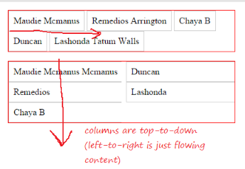
When we say that we want content to be in columns, it means a top-to-down flow instead of just left-to-right wrapping flow. For this we require CSS Columns.
The trick would be to specify auto for column-count / column-width. This will automatically distribute the content into the number of columns required within the parent width.
I made a fundamental mistake in the above statement (hence another edit). As per the specs here the algorithm says:
(01) if ((column-width = auto) and (column-count = auto)) then
(02)      exit; /* not a multicol element */
This is where I was wrong earlier. When both column-count and column-width are set to auto then it is treated as not a multicol element. When one of these properties is set to non-auto value, then the other property is determined by this one.
From the above ref:
if column-count is set to auto, then the number of columns will be determined by other properties (e.g., column-width, if it has a non-auto value)
and
if column-width is set to auto, then the column width will be determined by other properties (e.g., column-count, if it has a non-auto value)
An example would be to set column-width to a fixed-width, say 120px (we will deal that in part 2 a little later):
.container { -webkit-columns: auto 120px; columns: auto 120px; }
This will cause the container to fit the content in as many columns as it can for a column width of 120px within its own width. If you increase the container width, it will get more columns. If you decrease the container width, it will get less columns eventually collapsing to a single column when there is not much space available.
See the complete example in snippet below:
Example 1:
* { box-sizing: border-box; padding: 0; margin: 0; }
p { margin-left: 16px; }
.container { width: 400px; border: 1px solid #f00; margin: 16px; }
.container.col { -webkit-columns: auto 120px; columns: auto 120px; }
.container > div {
-webkit-column-break-inside: avoid; column-break-inside: avoid;
display: block; padding: 8px; border: 1px solid #ccc;
}
#one { width: 200px; }
#two { width: 300px; }
<p>Small Container (1-column):</p>
<div id="one" class="container col">
<div class="item-min">Maudie Mcmanus</div>
<div class="item-min">Remedios</div>
<div class="item-min">Chaya B</div>
<div class="item-min">Duncan</div>
<div class="item-min">Lashonda</div>
</div>
<p>Medium Container (2-column):</p>
<div id="two" class="container col">
<div class="item-min">Maudie Mcmanus</div>
<div class="item-min">Remedios</div>
<div class="item-min">Chaya B</div>
<div class="item-min">Duncan</div>
<div class="item-min">Lashonda</div>
</div>
<p>Large Container (3-column):</p>
<div id="three" class="container col">
<div class="item-min">Maudie Mcmanus</div>
<div class="item-min">Remedios</div>
<div class="item-min">Chaya B</div>
<div class="item-min">Duncan</div>
<div class="item-min">Lashonda</div>
</div>


